Simplicity is key
This is one that can be very easy to forget during the design process, but it’s perhaps one of the most important tips! A simple logo is memorable, versatile, and easy to recognise. Iconic logos like Apple's bitten apple or Nike's “swoosh” are excellent examples – they’re simple yet instantly recognisable. A cluttered or overly complicated logo can be confusing to consumers and difficult to reproduce across different mediums.
To sidestep those pitfalls, it’s best to focus on keeping your design clean, uncluttered, and focused on conveying your brand's message clearly and succinctly. Simplicity is success.
Colour psychology and branding
The colours you choose for your logo can have a significant impact on how your brand is perceived – more so than some people realise! We won’t go too much into the science behind us, but the short version is that different colours evoke different emotions and associations, so it's worth taking the extra time to ensure you’re picking colours that align with your brand's message and target audience.
For example, blue is often associated with trust and reliability, making it a popular choice for financial institutions and healthcare brands, while red can evoke feelings of excitement and passion, making it the go-to option for brands in the food and beverage industry. So, when you’re designing your logo, the first place to start is by thinking about what kind of feelings you want people to associate with your brand – that may then play a defining role in influencing the colour.
Typography and typeface selection
Alongside colour, the typography (or font, if you like) also plays a crucial role in logo design – the visual styling of your wording can convey as much meaning as the imagery itself. The right typography can evoke a sense of professionalism, playfulness, elegance, or innovation, depending on your brand's personality and target audience.
That means that when you’re selecting a typeface for your logo, it's a good plan to consider factors such as readability, scalability, and compatibility with your brand's identity, so that you can ensure that it complements your logo's overall design and reinforces your brand message effectively.
Don’t forget that instantly recognisable fonts like Times New Roman tend to have pre-established associations in most people’s minds (usually not very good ones), but at the same time, it’s really important to keep everything legible. And of course, maybe steer clear of Wingdings.
Scalability and adaptability
A successful logo design is one that remains effective and recognisable across various applications and scales. So when you’re designing your logo, one of the very first questions you’ll probably need to ask is: where is this logo primarily going to be seen? In print, or digital? On your website, or emblazoned on a fleet of vans?
It's possible that your logo is more likely to be seen in one setting over others, or it may be likely to be seen in each of them just as much as each other. In which case, it just goes to underline how important scalability and adaptability both are.
Your logo should look just as impressive on a billboard as it does on a business card or website, so you’ll need to ensure that your logo design is scalable (meaning it can be resized without losing its visual impact or clarity). What’s more, you’ll also need to think about how your logo will appear in different formats, such as black and white or grayscale, to ensure versatility and adaptability across different mediums and platforms.
Reflect your brand identity
Ah, perhaps the most important point of all – and arguably the one that all the others are working towards.
Your logo is often the first impression customers have of your brand, so it's essential that it accurately reflects your brand identity. So before you put the proverbial pen to paper, you’ll need to have established exactly what sets your brand apart from competitors, and how you want to be perceived by your target audience. When it comes right down to it, your logo should embody your brand's values, personality, and unique selling points. So, whether you're aiming for a sleek and modern look or a more traditional and elegant feel, make sure your logo design aligns with your brand identity to create a cohesive and memorable brand image.
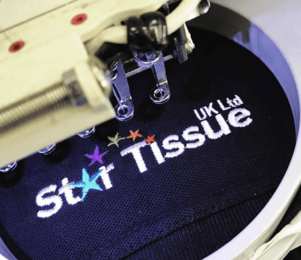
And of course, once you’ve got your logo design finalised, we can help you get it seen by your audience and customers here at City Workwear. And if you’re looking for the very best workwear, you’re in exactly the right place.
We have a huge range of garments to choose from – ranging from T-shirts and polo shirts to sweatshirts and workwear bundles. And as we’ve touched upon, all of our customisations are done in-house using our experienced team of designers and print machinists, so you can liaise directly with us to get exactly what you’re looking for. We also provide a FREE workwear printing and embroidery service and FREE delivery for orders over £150!
Feel free to take a look around our website to see what you can find, or alternatively give our team a call on 0330 004 0440, and we’ll be happy to help however we can!