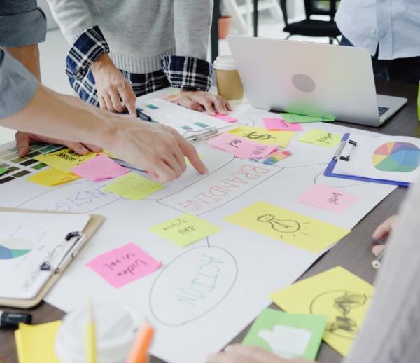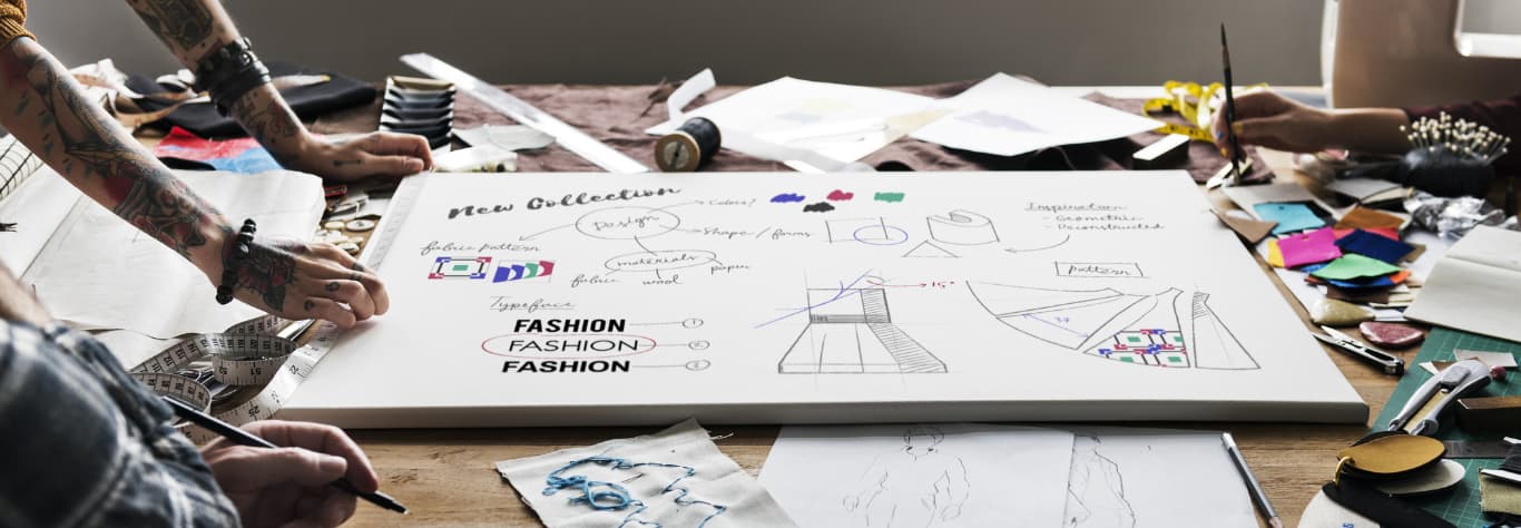
General tips
If you have a logo already established, but it looks like there’s a good chance it may be too small for your workwear, essentially you’ll need create a pared-back version of your design for embroidery, focusing on the most important elements.
Fine lines and intricate patterns often merge once they’re reduced, so a good place to start is by removing unnecessary decoration, which helps to protect the clarity of the design. Bold shapes, simplified icons, and strong outlines will all ensure the embroidery machine can reproduce your brand accurately even at smaller scales.
Text plays an equally important role. You’ll need to consider the lettering in your logo, as small fonts with thin strokes or ornate flourishes can lose clarity when reduced. You’ll get sharper results if you stick with straightforward typefaces that carry weight and avoid excess flourishes. It’s a good idea to request embroidery samples of your logo at the smallest size you intend to use. This enables you to check readability on items like caps, sleeves, and breast pockets before committing to a full run of garments.
How thread types and stitch counts affect your design
The type of thread used in embroidery influences both the look and durability of your logo. Standard polyester threads can be distinguished by their strength and a slight sheen that catches the eye, while rayon threads are noted for a slightly softer finish. Metallic and speciality threads can add visual impact, but they can also make small designs harder to read if they’re used too heavily. All this goes some way to show why thread choice is so important – if you can pick the right one early, it can really help you keep the right balance between style and clarity for your logo.
Stitch count is another critical factor. Each logo requires a set number of stitches depending on its size and level of detail. Our team balances stitch density to suit the size of your logo, which prevents the fabric from puckering, and keeps the detail clear. Our team can adjust stitch direction and layering so your design stays clear and consistent across all garments.
Colour choices that keep your logo legible
Colour has a major impact on how easy it is to read a small embroidered logo. A strong contrast between thread and garment fabric can often provide the clearest results, with light-on-dark or dark-on-light combinations standing out best. If your brand colours are close in tone to the garment itself, you’ll need to build in a border or outline in a contrasting shade to stop the logo blending into the background. Even a narrow outline can make the difference between a design that pops and one that fades into the fabric.
You’ll also need to think about how different colour combinations hold up once they’re stitched. As we’ve touched on above, some colours that work well on screen don’t always translate into stitch, especially if they’re pale or muted. Pastel shades can vanish when they’re reduced, while overly subtle gradients can sometimes lose their effect altogether. Sticking to bold, saturated tones for small logos will help them stay vibrant and visible. Limiting the total number of colours that are used can also improve the clarity of the design. Too many shades stitched close together tend to blur, so it’s always handy to look at the best ways to simplify your palette – it helps ensure that every element of your logo remains distinct.
The best techniques to preserve detail in your embroidery
Specialist embroidery techniques help keep your logo sharp at smaller sizes. Underlay stitching creates a stable foundation beneath the visible design, holding the fabric steady and reducing the risk of distortion. This ensures that the finished stitches stay aligned, and the design looks consistent from garment to garment.
Plus, you can always consult our team for the best ways to adjust individual elements of your logo, which protects the detail more effectively than shrinking the whole design. Other ways that often contribute to clarity include increasing the spacing between letters, thickening thin strokes, and altering stitch direction. These refinements enable your logo to keep its character and ensure that even the smallest version of your design remains bold, legible, and true to your brand.
These are all the essentials covered! And of course if you’ve got any question or need any advice about designing your logo – or adapting it for workwear – you can always ask our team here at City Workwear. We have extensive experience with providing personalised workwear for teams across a wide range of sectors, and all at the very best prices.
What’s more, all of our customisations are done in-house using our experienced team of designers and print machinists, so you can liaise directly with us to get exactly what you’re looking for. We also provide a FREE workwear printing and embroidery service and FREE delivery for orders over £150!
Feel free to take a look around our website to see what you can find, or alternatively give our team a call on 0330 004 0440, and we’ll be happy to help however we can!